S/S 2005

Click the above picture the view it clearly=]
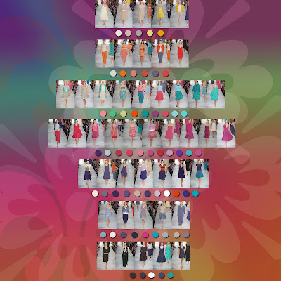
Jacobs sent out supersaturated, eye-delighting tones like parrot blue, azure, yellow, hot pink, and royal purple, often in the same outfit. With his irrefutable confidence, Jacobs can make colors that might ordinarily be at odds seem perfectly natural and a perfectly chic combination; an azure cardigan with a deep-navy brocade skirt, or a navy and white polka dot cardigan over fuchsia trousers. And in a season of hues that sometimes border on the anemic, it felt like a trip to the tropics. And for those party moments, he reprised the shredded-and-stitched organza ruffle dresses of last year, this time decorated so densely they looked like the plumage of a bird of paradise.

Monochromatic color scheme is used. I love this blue-green color, since it gives me freshness. Together with the pink, it's really feel like I'm in the birds paradise!


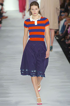
Complimentary color scheme is used, orange and blue is used. It is important to highlight that the colors of the stripes are opposite to each other in the color wheel, because orange and blue are also used on the trousers. I think that principle of order is also applied because the orange are directly contrasting to each other in this outfit. Also, orange gives me fun ,happy and energetic feelings.
Although the theme is about birds paradise, it's colorful, Jacobs never gives up his achromatic color scheme.
Color Family:
FALL 2005
Click the above picture the view it clearly=]
The show started off on a somber note with nubby black jackets and midcalf-length navy skirts that floated mysteriously around the models' legs, as if they'd been pumped up with air. Volume, and experimenting with it, became a recurring motif. Trapeze coats swung from shoulders; floral-print dresses ballooned behind Vlada and Lily as they tromped down the runway; and one moiré dress tented out beneath a chevron-striped mink coat. Another theme was embellishment. Rosettes adorned everything from the bust of a strapless velvet dress to a tweed muffler; tattered collars decorated jackets; and cardigans and knit caps were veiled with lace. But despite the parade of party dresses, some in black point d'esprit and others with flashes of colorful silk, it wasn't all girly, all the time. There's room in Jacobs' story for a tomboy or two, and they were dressed the part in rugby-striped sweaters that brought his grunge collection to mind.
Monochromatic color scheme is used. Different intensity of khaki is applied, this gives a sense of warmth and stability. Together with the silouette of the outfits, it's so volumous that it's really warm.
Achromatic color scheme is used. Black brings the elegance and formality to the women. It is a sophisticated color scheme used frequently by Jacobs.
The principle of order and analogous color scheme are used. This time, the contrast is even bigger. Since golden color is shiny and sharp, which gives me even a stronger feeling. I appreciate Jacobs's color sense.

Monochromatic color scheme is used, different intensity of navy blue is used. I think that because of the material used, the blue color is very shine. Meanwhile, I think the principle of order is used. Because black is the main color of the outfits, and blue is used to add the details to the outfits.
Color Family:
SUMMARY:
In 2005, the color schemes that Jacobs always use are Complimentary, Achromatic and Monchromatic Color Scheme. In the collection, black is always used when Jacobs doing the theme VOLUME, also, he used many dull, dark color to project the volume feeling.
No comments:
Post a Comment